Sacred Colors: Where Jewish Tradition Meets Creative Expression
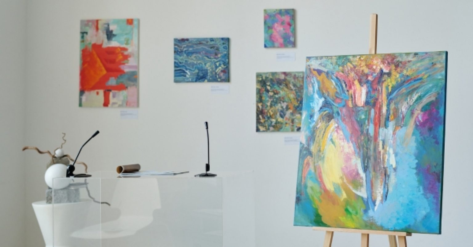
Across centuries, color has acted like a quiet melody in Jewish life, humming through ritual, memory, and art with surprising nuance and heart. From ancient threads of blue to the warm shimmer of gold, hues carry teachings that feel both intimate and shared, both rooted and wildly creative. Artists today are mapping those meanings onto canvases, textiles, and digital screens, letting tradition and experimentation talk to one another. The result is a living palette that keeps faith recognizable yet refreshingly new, as if each shade were a familiar friend showing up in an unexpected outfit.
From Sinai to Studio: The Language of Judaica Colors
In Jewish sources, color is less about decoration and more about conversation, a set of hues in dialogue with texts and practice. The deep blue of tekhelet whispers about the sky and the sea, pointing imagination upward toward the Infinite and downward toward the depths of wonder. White suggests renewal and spiritual clarity, a blank field where a person can sketch new beginnings without erasing the past. Gold and crimson bring warmth and presence, hinting at sacred space, royal dignity, and the courage to kindle light in ordinary days.
What makes this language feel so current is how naturally it moves from parchment to paint, from prayer shawl to poster. A single stripe of blue on linen can anchor an entire room, reminding viewers that beauty often works best when it is quiet and intentional. Meanwhile, a flash of red can reignite a scene, like a spark catching in wood, energizing ritual objects without overwhelming them. Each color functions like a verb: blue beckons, white clears, red animates, and gold resolves.
In the studio, artists blend inherited meanings with the needs of modern life, testing tones the way scholars test ideas. A cooler blue might dial up contemplation, while a warmer gold softens an otherwise austere space, inviting conversation to linger. Many creators keep a small “tradition key†nearby—a note of which colors signal which values—then allow instinct to improvise. The aim is not replication but resonance, so the finished work feels both learned and alive.
Blue Threads, Red Threads: Symbols That Still Breathe Today
Some colors arrive with stories already wrapped around them, and those stories still breathe in contemporary pieces. Blue, born of tekhelet, reaches toward transcendence; white, paired with it, maps out a kind of spiritual horizon, uncluttered and bright. Red can hold both fire and responsibility, echoing courage, covenant, and sometimes the cost of commitment. Gold steps in as the steadying tone, recalling sacred vessels and the glow of held light in the heart of winter.
Essential symbolic color pairings to know:
- Blue + White: transcendence and renewal, a prayerful calm that clears the path ahead.
- Red + Gold: courage and sacred presence, a flame that warms rather than scorches.
- Green + Silver: growth and clarity, a fresh canopy with a clean-edged glint.
- Purple + Parchment: dignity and study, a royal hush beside the rustle of learning.
Context matters just as much as hue, so the same red that feels bold in a gallery can feel protective on a ritual cover or scroll case. Blue reads differently at dawn than at dusk, and gold shifts character under candlelight, thickening into a mellow, ancestral tone. Artists treat those shifts as cues rather than constraints, letting light, season, and setting shape the final composition. The conversation remains: color asks its questions, and the viewer answers with breath, memory, and a slower gaze.
Materials Matter: Where Pigments, Light, and Modern Media Meet Meaning
Meaning lives in materials, too, which is why choices about pigment, fabric, glaze, or LED warmth can tilt a piece toward hush or celebration. A matte blue linen sings differently than a high-gloss ceramic glaze, even if their hex codes match. Metallic leaf catches Shabbat candles in a way digital gold cannot, while digital gradients can layer stories that physical paint might muddy. When the message is sacred, the medium should be a partner, not a megaphone.
Steps to build a palette with intention:
- Start with a value—rest, courage, gratitude—and let that choose the lead color.
- Pick one supporting hue that balances the lead rather than echoing it too closely.
- Test under real lighting—daylight, candles, soft evening bulbs—to see how meanings shift.
- Limit saturation so sacred accents can do the heavy lifting without shouting.
- Document the choices, noting how each shade ties back to story, ritual, or text.
Collectors looking for work that honors both tradition and freshness often find that curated galleries help filter the noise. Within that hunt, a quick look at huvy art can spotlight pieces where hue, material, and meaning lock into place without feeling stiff. It is the difference between decoration and devotion—a palette that serves the story rather than steals it. And when the story feels served, rooms tend to breathe easier, like windows opened just enough to let in morning air.
Color Cues at Home and in Ritual: Designing with Intention
A home that holds ritual objects can choreograph color to reflect time and intention rather than trend alone. For Shabbat, cools and neutrals may calm the week’s static, while a tempered gold catches candlelight and nods toward joy. Holidays can bring in purposeful intensity—pomegranate reds or harvest greens—nudged to whisper rather than shout. In between, a slim ribbon of blue can act as a daily thread, tying ordinary moments to the larger story.
Those curating contemporary moments of presence often use color like a compass rather than a map, adjusting tone and placement as rooms change function. A mezuzah’s glaze might echo the blues of a nearby textile, inviting a quick glance and a slower breath at each threshold. A tabletop piece might warm with a hint of brass, signaling gathering and gratitude without tipping into flash. In each choice, the goal is the same: to make meaning visible without making it heavy.
For seekers assembling a coherent collection of ritual pieces and art, sources that blend scholarship with style can save a lot of second-guessing. In that spirit, exploring curated contemporary judaica helps connect color decisions to both heritage and current aesthetics in one sweep. The right hue does not preach; it prompts, inviting hands to lift, eyes to rest, and voices to soften. Over time, those cues become a household’s shared language, as recognizable as a favorite melody.
A Living Palette in Numbers and Meanings: From Symbolism to Hex Codes
Color names can feel poetic, but artists and designers also lean on concrete references so choices stay consistent across mediums. Below is a concise snapshot aligning core symbolic hues with typical contexts and commonly used digital hex values today. It serves as a bridge between studio intuition and practical coordination across print, textile, and screen.
| Color | Hebrew note / Origin | Traditional symbolism | Ritual context | Modern hex code | Contemporary use (2025) |
|---|---|---|---|---|---|
| Blue (Tekhelet-inspired) | Tekhelet thread; sky and sea | Transcendence, mitzvah awareness | Tallit stripes, fringes | #1E5AA7 | Textile accents, glasswork gradients |
| White | Purity, renewal | Clarity, teshuvah | Holiday garments, parchment | #FFFFFF | Negative space, minimalist framing |
| Red | Pomegranate, flame | Courage, covenant, vitality | Holiday motifs, ceremonial covers | #C1272D | Calligraphic highlights, ceramic accents |
| Gold | Sanctuary vessels | Sanctity, royalty, light | Candlesticks, decorative trim | #D4AF37 | Metal leaf details, warm lighting schemes |
| Green | Growth, land | Hope, renewal | Harvest themes, home decor | #2E7D32 | Botanical prints, woven runners |
| Purple | Royal textiles | Dignity, wisdom | Covers, ceremonial sashes | #6A1B9A | Mixed-media depth, shadow glazes |
In short, the table shows how symbolic intention and practical color codes cooperate so pieces stay faithful in spirit and consistent in execution. Those hex values function like a shared vocabulary that travels smoothly from digital mockup to dyed fabric or kiln-fired glaze. Even small alignments—matching a tallit stripe to a print’s accent—can make disparate objects hum together like a well-tuned quartet. The goal is harmony, not uniformity, leaving room for delight when light and texture bend a tone just so.
Beyond codes, the human element remains the deciding factor: the pause before a brushstroke, the choice to tone down saturation, the courage to leave a clean expanse of white. A piece breathes when space and color mutually respect each other, like friends who know when to speak and when to listen. If a viewer’s shoulders drop a little in front of the work, the palette has done its job. That small release is often the first step toward deeper attention.
Closing the Circle of Sacred Colors Today: Tradition in Motion
Bringing sacred colors into modern life is less about rigid codes and more about thoughtful hospitality, inviting meaning to sit comfortably at the table. A good palette makes room for both ancestry and improvisation, letting a blue from yesterday meet a gold from tomorrow without friction. Artists and collectors alike can ask simple questions—What value leads here, and which hue serves it best?—then follow the answers with patience. The beauty is that the conversation never ends, and it never needs to.
As rooms evolve and rituals ebb and flow, colors can be tuned like instruments, refreshed without losing their voice. A cooler blue for focus during study, a warmer gold for gatherings, a grounding green for the daily work of kindness—tiny shifts accumulate into a recognizable home melody. Consistency is not sameness; it is a reliable pulse that lets highlights shine when it matters. Over a season, palette choices begin to feel like trusted companions, not design homework.
In the end, sacred colors earn their place by how gently they guide attention and how generously they share the stage with story, text, and people. When craft, symbolism, and lived experience line up, creativity stops performing and starts belonging. That is the quiet victory where Jewish tradition meets creative expression: a living spectrum that honors its sources while lighting the way forward, one considered shade at a time.